
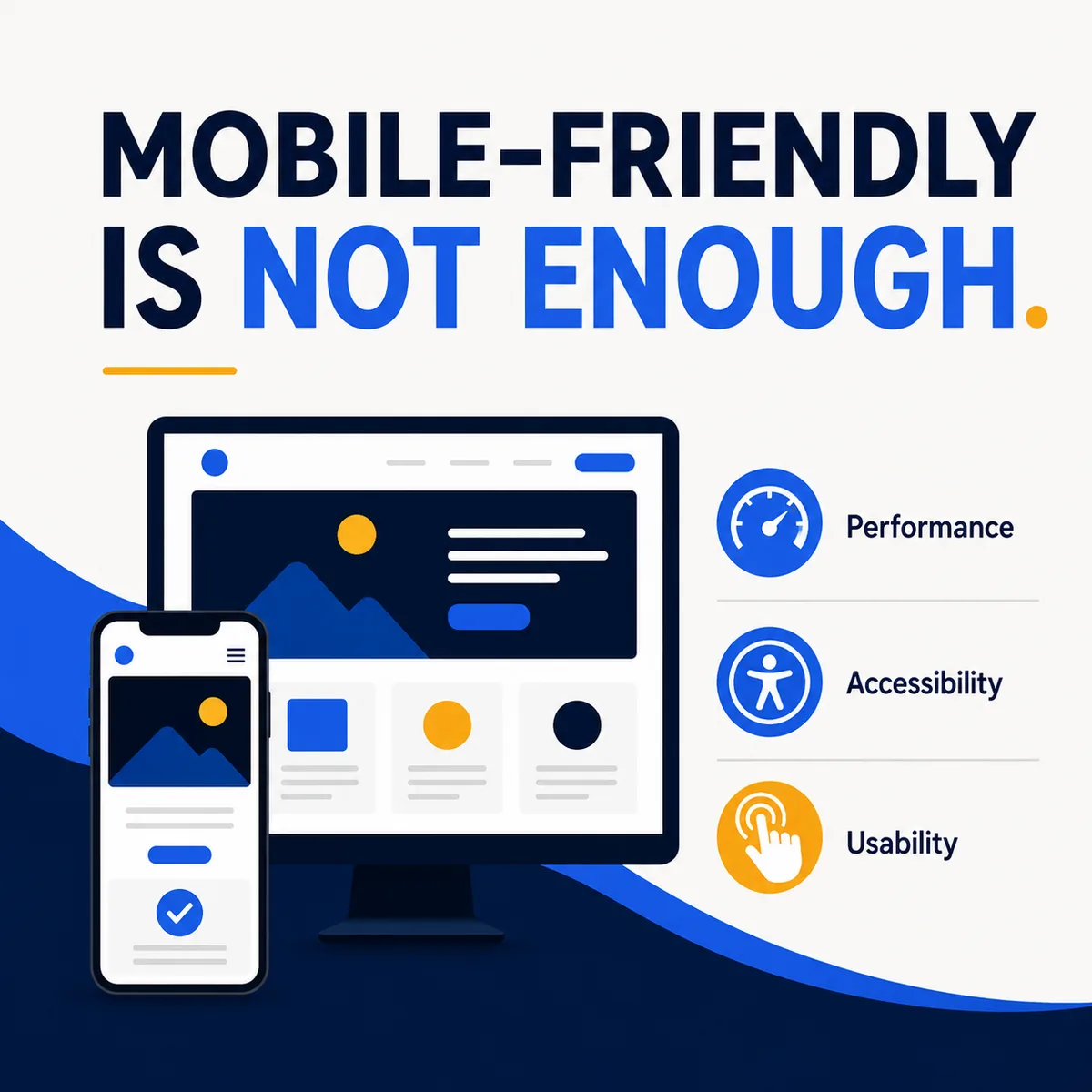
Mobile-Friendly Is Not Enough
Most organizations know their website should work on a phone. However, “mobile-friendly” is often interpreted too narrowly. A page may technically fit within a small screen and still be frustrating, slow, confusing, or inaccessible.
An effective modern website must address three connected areas: mobile usability, website performance, and accessibility. These are not merely technical concerns. They directly affect whether visitors can understand and use the website.
Mobile Design Must Be Intentional
Responsive design allows a website layout to adapt to different screen sizes. Google recommends responsive design and uses mobile content as the basis for indexing websites. But responsive technology alone does not guarantee a strong experience.
Mobile design requires decisions about heading size, text length, image cropping, button placement, menu behavior, section spacing, form fields, content order, tap-target size, and popups or overlays.
A four-column desktop section should not simply become four extremely long mobile sections without considering priority and readability. Likewise, a large decorative headline that looks impressive on a monitor may occupy most of a phone screen and push the useful information out of view.
Mobile design should be reviewed as its own experience, not treated as the automatic byproduct of the desktop layout.
Speed Is Part of the Design
Website performance is often discussed as though it belongs exclusively to developers. In reality, design decisions have a significant effect on speed. Common causes of slow pages include:
- Oversized photographs
- Uncompressed video
- Too many font files
- Excessive animation
- Unnecessary scripts
- Complicated page-builder effects
- Poor hosting
- Outdated plugins
- Third-party tracking tools
Google’s Core Web Vitals focus on loading performance, responsiveness to interaction, and visual stability. Visual stability is especially important. Have you ever attempted to press a button just as an advertisement or image appeared and moved the entire page? That is a layout-shift problem.
A website can be visually sophisticated without being overloaded. The strongest design decision is sometimes choosing not to add another effect.
Accessibility Helps More People Use the Website
Website accessibility addresses the ability of people with disabilities to perceive, understand, navigate, and interact with online content. Users may rely on screen readers, keyboard navigation, voice control, screen magnification, captions, alternative text, high-contrast settings, and other assistive technologies.
Color Contrast
Text needs sufficient contrast against its background. Light-gray text on white may fit a minimalist aesthetic but can be difficult for many people to read. Color should not be the only method used to communicate meaning. For example, required fields should not be identified only through red text.
Heading Structure
Headings should organize the page logically. A clear heading hierarchy helps all visitors scan the content and allows people using assistive technologies to understand the structure of the page. W3C guidance recommends headings that clearly and concisely describe each section.
Alternative Text
Meaningful images should include alternative text that communicates their purpose to visitors who cannot see them. Decorative images can be identified as decorative so they do not create unnecessary interruptions for screen-reader users.
Forms
Every form field should have a clear label. Placeholder text inside a field is not always an adequate replacement, because it may have weak contrast and disappears after the visitor begins typing. Forms should also provide understandable instructions and useful error messages.
Keyboard Navigation
A visitor should be able to reach links, buttons, menus, and form controls without using a mouse. Interactive elements should display a visible focus indicator so the visitor can identify the currently selected item.
Video and Audio
Videos containing speech should include accurate captions. Important audio information may require a transcript.
Accessibility and Usability Overlap
Many accessibility improvements benefit a much broader audience. Captions help someone watching a video in a quiet office. Strong contrast helps someone looking at a phone in bright sunlight. Clear labels help a visitor complete a form quickly. Keyboard support helps someone whose mouse has stopped working. Simple navigation helps visitors who are distracted, hurried, or unfamiliar with the organization.
Clear design is inclusive design.
Test Real Pages on Real Devices
Website review should include more than dragging a browser window to a smaller width. Test the website on multiple phone sizes, tablets, desktop computers, current browsers, touchscreens, and with keyboard-only navigation.
Review important tasks such as completing a contact form, registering for an event, making a donation, finding a phone number, reading a service page, opening the navigation, and downloading a document.
Automated testing tools are valuable, but they cannot identify every usability or accessibility problem. Human review remains essential.
A Better Experience Produces Better Results
A website that loads quickly, works well on a phone, and accommodates different users communicates care and professionalism. These qualities also reduce friction. Visitors can find information, complete tasks, and take action without fighting the interface.
That is the real objective of responsive design, performance optimization, and accessibility: helping more people successfully use the website.
Not sure how your site holds up on a phone, or for someone using a screen reader? I can take a look.
Start a Project