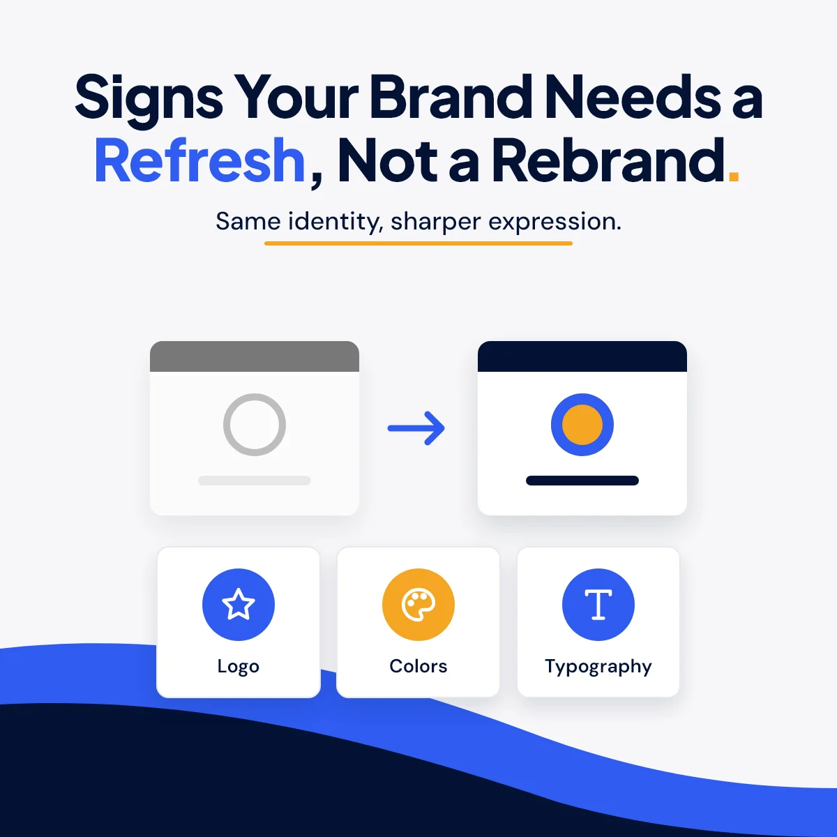
Signs Your Brand Needs a Refresh, Not a Rebrand
When an organization's materials start to feel tired, the first instinct is often "we need a new logo." Sometimes that's true. More often, the logo is fine. The problem is everything around it: five versions of the same mark, three slightly different blues, and flyers that look like they came from three different organizations.
That is not a rebrand problem. That is a refresh problem, and it is usually smaller, faster, and less expensive to fix.
Refresh or Rebrand: What's the Difference?
A brand refresh keeps what people already know about you, your name, your recognizable mark, your reputation, and updates how it shows up. That can mean a cleaner version of the logo, a defined color palette, consistent fonts, and templates that make every new piece look like it belongs.
A rebrand changes who you are in public: a new name, a new identity, sometimes a new position in the market. It is a bigger decision with a bigger rollout.
Most small businesses, nonprofits, and associations I talk with need the first one.
Why It Matters More Than It Seems
People judge how professional you are before they read a word. Research summarized by the Nielsen Norman Group found that a judgment about a website's look can form within about 50 milliseconds, and that the first judgment rarely changes with more time.
Stanford's long-running web credibility research reached a similar conclusion. One of its guidelines is to design so the site "looks professional (or is appropriate for your purpose)," because "people quickly evaluate a site by visual design alone."
There is a practical upside too. Nielsen Norman Group describes the aesthetic-usability effect: people tend to see attractive designs as easier to use, and are more forgiving of small problems when the design feels right.
In plain terms, a polished, consistent look buys you trust you haven't had a chance to earn yet.
Eight Signs Your Brand Needs a Refresh
1. Your logo doesn't work small
Look at your logo as a social profile picture, a browser tab icon, or embroidered on a shirt. If the words turn to mush or the details disappear, you need a simplified version for small spaces.
2. Nobody can find the "real" logo file
If your team sends around a blurry JPG with a white box behind it, or there are six versions in six folders, you don't have a logo problem. You have a files problem. A refresh fixes it once.
3. Your colors drift
The blue on the website, the blue on the banner, and the blue on the business card are three different blues. That happens when no one has written down the exact color codes for print and screen.
4. Every piece looks like it came from somewhere else
The newsletter, the event flyer, and the Facebook graphics should feel like one organization. If they look like three different ones, people have to work harder to recognize you.
5. Your materials look less professional than your work
This is the most common one I see. The organization does excellent work, and its brochure looks like it was put together in an afternoon. That gap costs you, because people use the look of your materials to guess the quality of everything else.
6. You've grown and the brand hasn't
New services, new programs, a new audience. If your brand was built for the organization you were five years ago, it may not have room for what you do now.
7. You apologize when you hand something over
If you've ever said "ignore the brochure, it's old," that's your answer.
8. People rebuild every piece from scratch
When staff or volunteers start from a blank page every time they make a flyer, the results will never match. Simple templates solve this and save hours.
When It Really Is Time for a Full Rebrand
A refresh won't fix everything. A full rebrand may be the right call when:
- Your name regularly causes confusion with another organization.
- You've merged with another organization or changed what you fundamentally do.
- Your current identity is tied to a reputation you need to move past.
- The audience you need to reach has changed completely.
If none of those apply, start with a refresh.
What a Good Refresh Should Include
The exact list depends on the organization, and it should be agreed on before work begins. A solid refresh usually includes:
- Logo variations: a full version, a compact or stacked version, an icon for small spaces, and one-color versions.
- Color standards: exact codes for print and for screens, so the blue is always the same blue.
- Typography: which fonts to use for headlines and body text, and where.
- Supporting elements: patterns, icons, or graphic shapes that make your materials recognizable even without the logo.
- Templates: for the things you make most often, such as flyers, social graphics, and presentations.
- Short usage guidance: a few pages people will actually read, not a 60-page manual nobody opens.
- Organized final files: in the right formats for print, web, and social, named so anyone can find them.
Keep What People Already Recognize
The goal of a refresh is not to change what already works. If your community knows your colors or your mark, that recognition is worth keeping. Good refresh work evolves what you have instead of throwing it away.
Roll It Out Everywhere You Show Up
A refresh only works when it shows up in all the places people see you. Make a list and update them together:
- Website and favicon
- Google Business Profile photos and logo
- Social media profile pictures and cover images
- Email signatures and newsletter header
- Business cards, letterhead, forms, and proposals
- Signs, banners, and event materials
A half-finished rollout leaves you with two brands instead of one.
How I Approach It
My Brand & Graphic Design work starts with what you already have. You don't need to arrive with a finished brand or a polished concept. If you have a logo, brand standards, photos, or written content, I work within those materials and create the missing pieces so everything feels connected. If you need something from scratch, I build that too.
Deliverables are set before work begins, so you know which concepts, formats, sizes, and final files are included. I provide free estimates, and files are prepared with their final use in mind, whether that's a print shop, your website, or a social feed.
Wondering whether your brand needs a tune-up or a fresh start? Send me what you're using now and I'll give you an honest read.
Sources
- Nielsen Norman Group, "First Impressions Matter: How Designers Can Support Humans' Automatic Cognitive Processing" (aesthetic judgment within about 50 ms; citing Lindgaard et al., 2006): https://www.nngroup.com/articles/first-impressions-human-automaticity/
- Stanford Persuasive Technology Lab, "Stanford Guidelines for Web Credibility," guideline 6 (people quickly evaluate a site by visual design alone): https://credibility.stanford.edu/guidelines/index.html
- Nielsen Norman Group, Kate Moran, "The Aesthetic-Usability Effect" (attractive designs perceived as more usable; more tolerance of minor issues): https://www.nngroup.com/articles/aesthetic-usability-effect/
Not sure how your site holds up on a phone, or for someone using a screen reader? I can take a look.
Start a Project